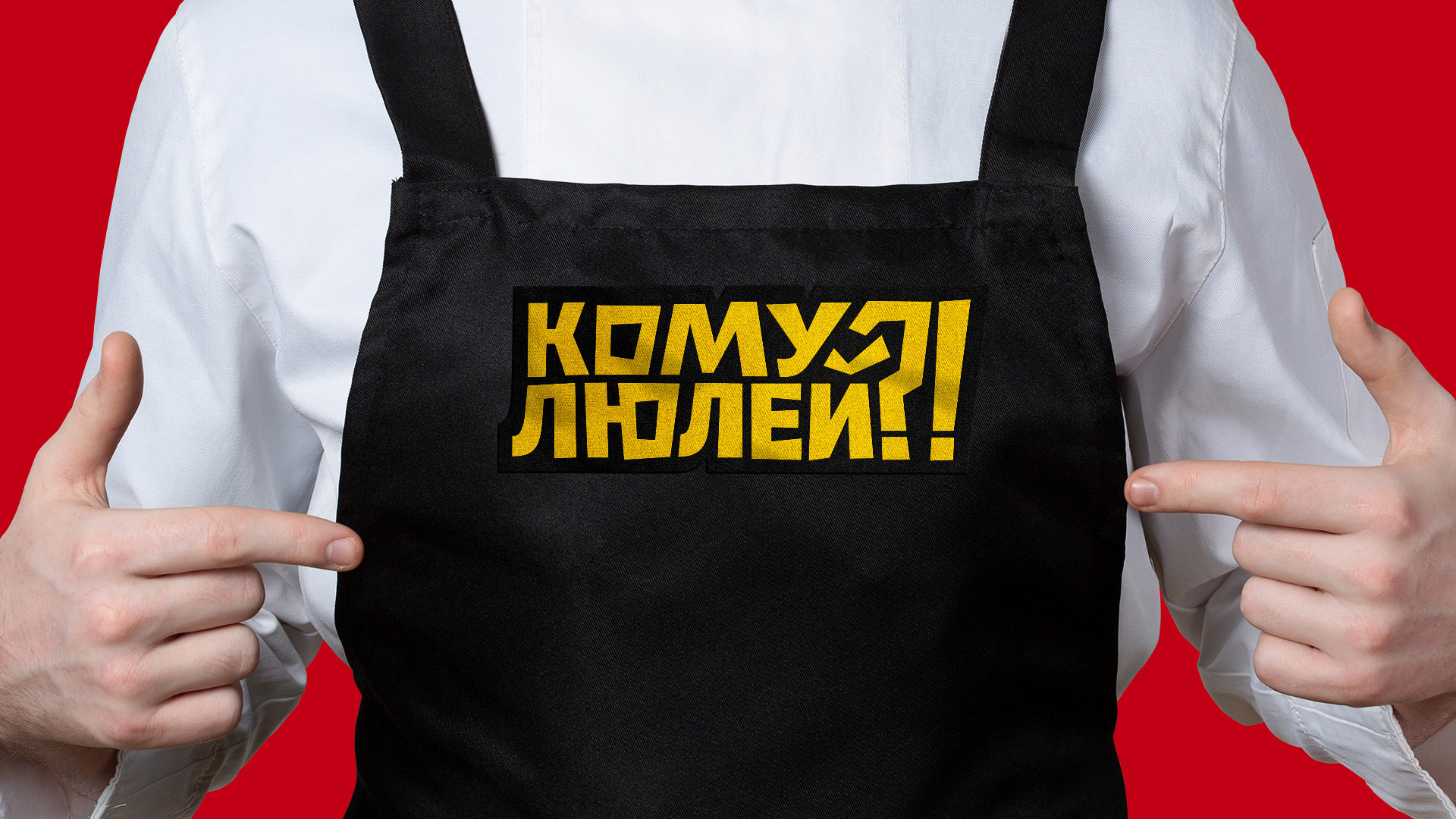
Partners came to us with an unfinished concept. The main product is a new interpretation of shawarma, which contains pita bread and chopped lula (kebabs), instead of classically cooked meat. For this product, they came up with a name – "KOMU LULEI?" (In English the translation is: “Who wants kebabs!?”).
We were engaged in further work and divided it into several stages:
• analyzed the competitive environment and found the market segment which was best suited for the company;
• conducted interviews with the project team;
• built models and hypothesized about the consumer needs;
• developed brand and communication tools on the basis of these factors.
Studies showed that most of our consumers are engaged in monotonous or exhausting work and use the meal break time as an opportunity to take a break and isolate themselves from the endless routine. Our clients have an incredible tandem of a masters in gastronomy and a masters in fun, which perfectly covered the needs and pains of the target audience.
Thus, we arrived ad the most accurate positioning of the brand:
"A federal fast food chain with high restaurant standards that offers a delicious and affordable product, seasoned with a good sense of humor."
"A federal fast food chain with high restaurant standards that offers a delicious and affordable product, seasoned with a good sense of humor."
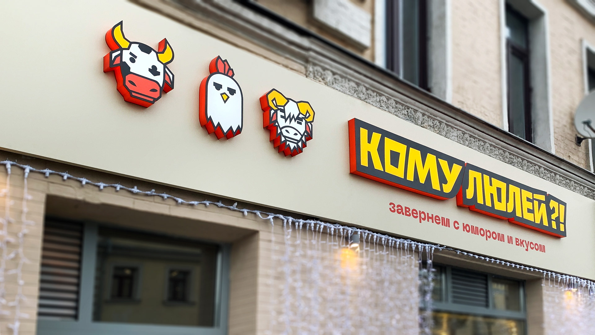
After that, we could start developing a corporate identity. The verbal-visual identification was based on bright colors, dynamics, a sense of celebration and fun. The font on the logo is as simple as possible in form, while inside the “brick” the letters walk in all directions. It emphasizes broad nationality and good humor. The logo is made up of the brand's DNA: even the question marks and exclamation marks are not accidental.
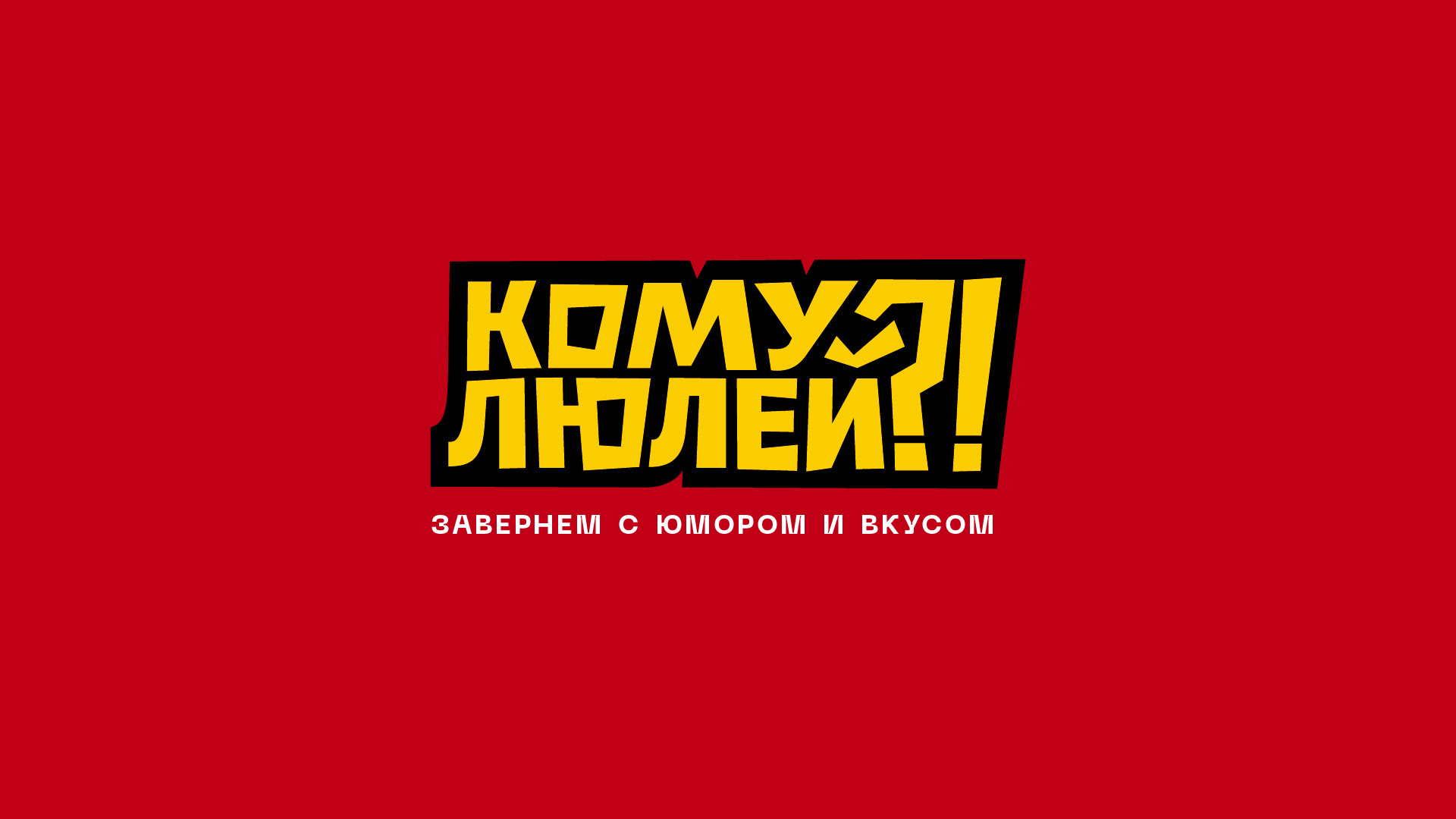
Wrapped with humor and taste
The logo is consciously made so bright in terms of graphics and forms. It allows the brand to remain recognizable in any color even at a great distance, and the combination of red and yellow is associated with the atmosphere of a delicious holiday in a cheerful company. Despite the visual simplicity of the folk style, we carefully selected shades for the long term.
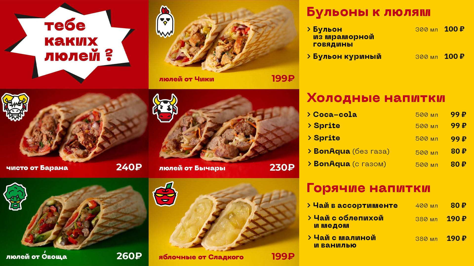
For the text in the menu, on banners and on packages, we used actual modern typography: jobbing font for headlines, artificial script for large volumes.
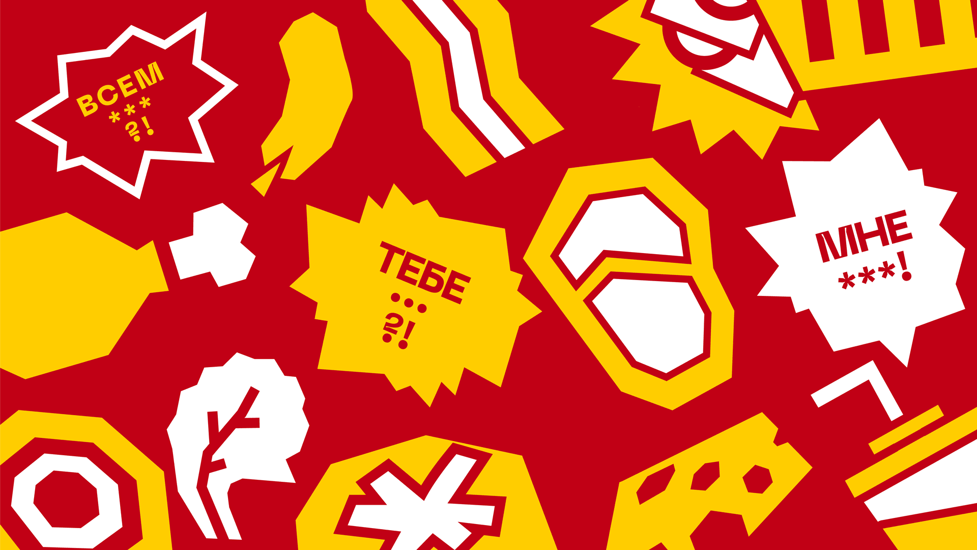
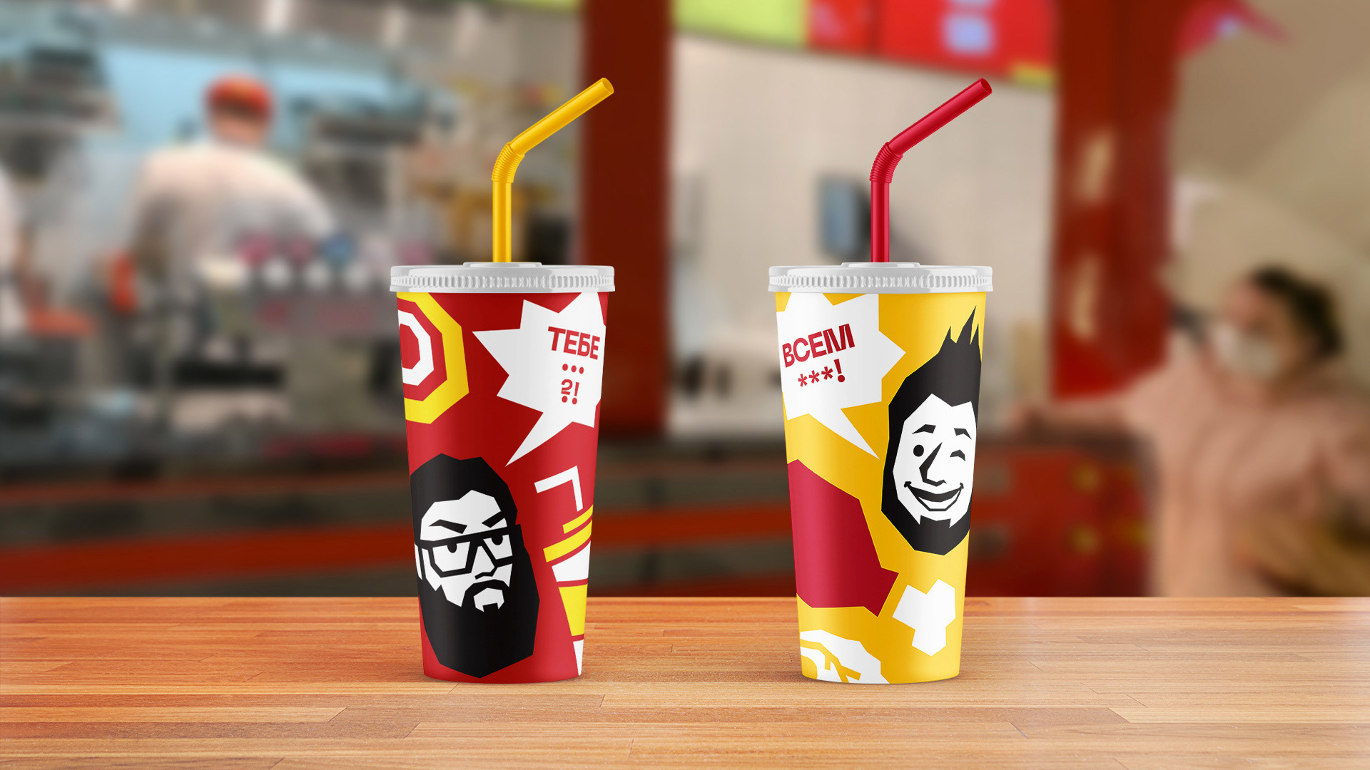
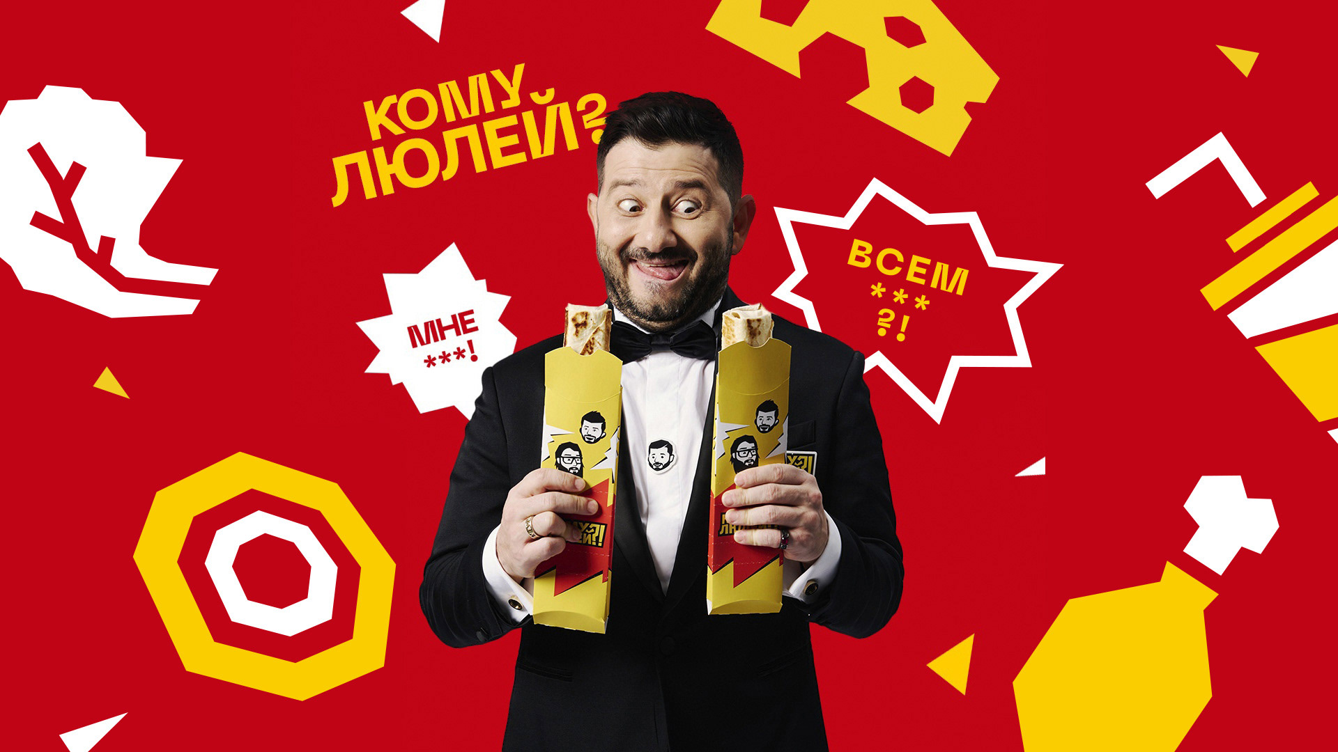
The pattern is continued in the logo: all elements are chopped, as large as possible and are simple in graphics. It reflects the idea of the brand as a celebration: the bubbles are associated with loud conversations, friendly disputes and a lively atmosphere. This also includes the question "Komu Lulei?!", a lot of punctuation marks and bleeping with asterisks.
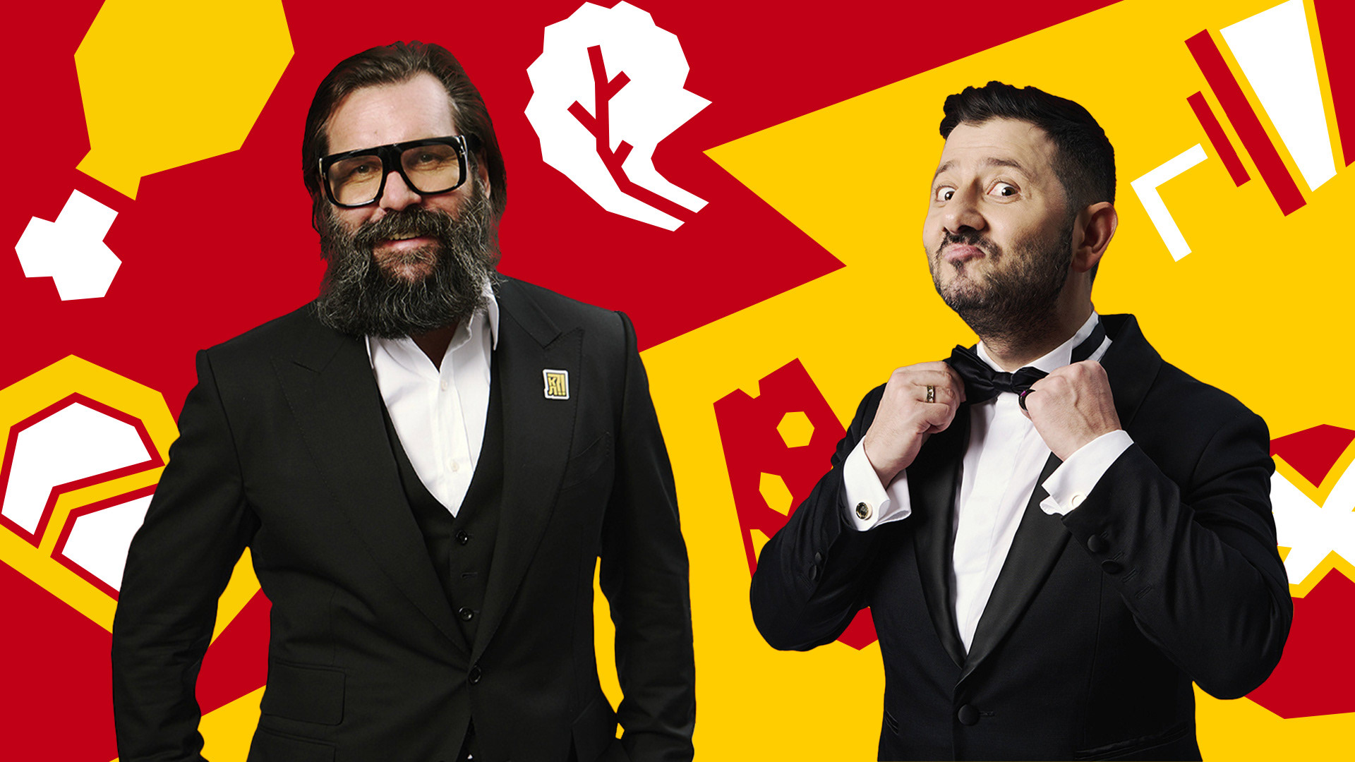
In addition, we needed to achieve a balance in communications while using the characters of Vasilchuk and Galustyan. However, bringing two media personalities together for a photo shoot each time we needed another set of materials was an almost impossible task.
We found a graceful solution and decided to use drawn heads with a range of emotions. At the same time, the characters remained absolutely recognizable, and a distinctive visual language appeared.
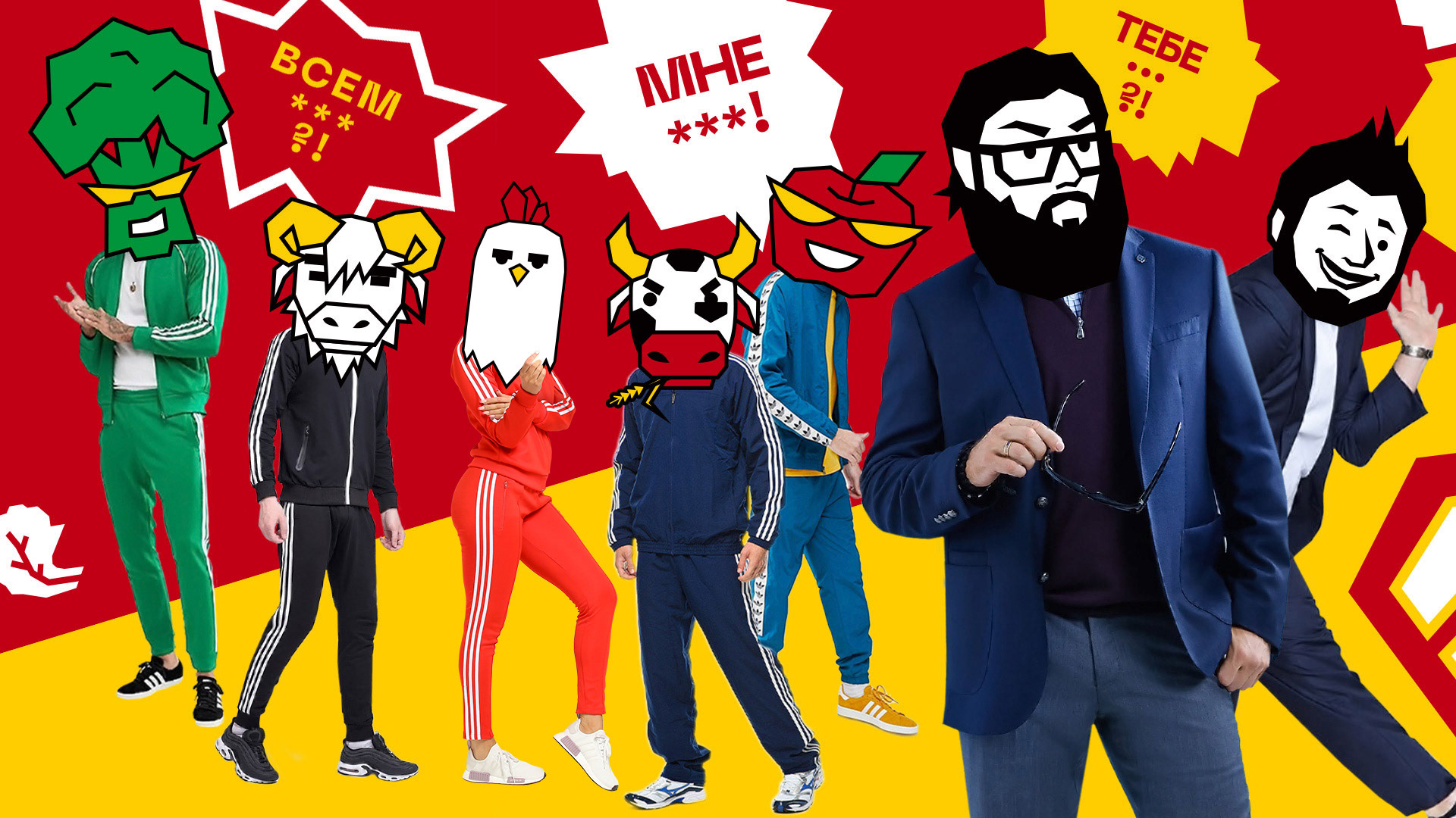
It is important that the characters are not just on the media materials quietly – they communicate with each other and with the target audience, delivering messages through bubbles: simple in form and explosive in graphic image. Vasilchuk talks about the quality and taste of the product, and Galustyan talks about the celebration and fun.
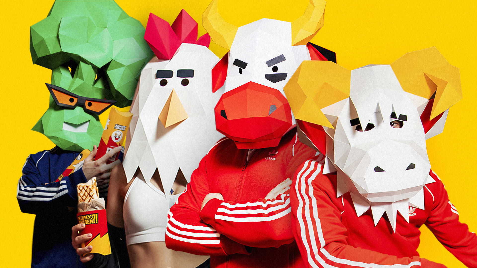
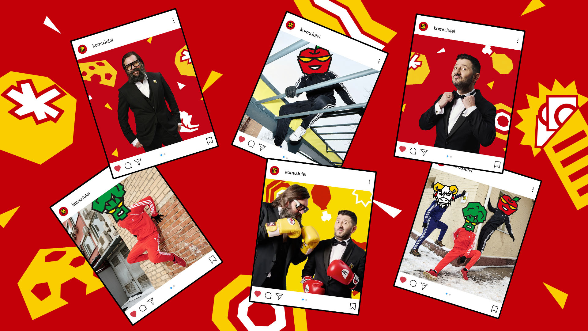
In addition, we made up characters for the key tastes of the products: moderately brutal, rather impudent guys from the street who echo our audience style. Thus the brand, in addition to the main persons, has a whole "gang".
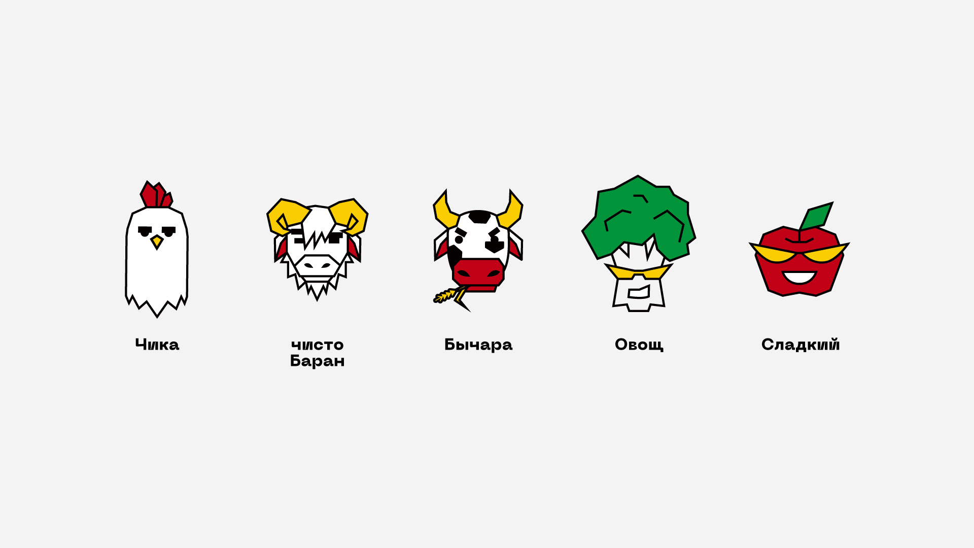
This is also not creativity for the sake of creativity. The "gang" has an almost inexhaustible potential for communicating with the audience and creating comics. All you need is to collect all the characters. Simple cheerful sketches can then be used both corporatly and in social networks.
At first glance, it may seem that the result is way too simple, almost like a naive folk story. In fact, all elements of the corporate identity were created very carefully and not at all by chance. We do not choose pictures to our taste (and even to the taste of the customer) – we develop a workable brand based on a clear understanding of the audience, product and key values of the company.
The project was implemented in collaboration with two partner agencies – Opencore and N:OW.
Project team
Karina Borisenok, Strategic director and partner
Michel Lelikov, Creative director and partner
Igor Demidov, CEO & Founder N:OW agency
Anastasia Gladkaya, Senior Account Manager N:OW agency
Denis Basevich, Art director
Dmitry Golub, Designer
Danuta Lobachenya, Strategist
Victoria Putilina, Designer
Sergey Kuleshov, Designer
Maria Vlasova, Designer
© Opencore